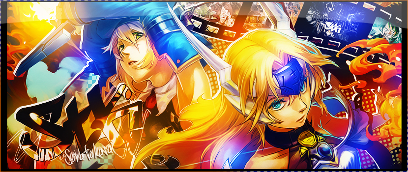
Well for a first graph it's really good actually xDD The first thing you need to pay attention to is the quality, we can see a lot of pixels in some parts, don't abuse of some effects when you see they reduce the quality.
The blue "shadow" behind the render is a bit too flashy imo, I think it would have been better if it was whiter.
Also the font looks weird, I don't think it really fits.
But still quite promising

Good job


